
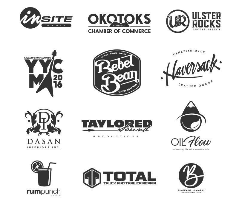
I’ve often been asked: “What’s the point of designing a logo in black and white?”
Now I know that a lot of clients dream of having beautiful, brightly coloured logo options to select when we go through a branding creation process but the designer and educator in me wants to let the world know why it’s so incredibly important to have a logo that works monochromatically (one colour) as well as in all of the colours of the rainbow.
You’ll realize soon enough that the more flexible your logo is, the easier it will be for branding. Here are just a few places where having a multicoloured logo won’t do you any favours:
PROMOTIONAL MERCHANDISE
I’d like to tell you a story about the client you insisted on having a multicoloured logo and then realized that most printing companies charge based on the amount of colours in their logo… A lot of businesses like to invest in promotional merchandise such as pens, notepads, coffee mugs etc. and due to the process involved in creating these, most promotional companies require a single colour logo. Although a lot of companies will print complex designs this usually comes at a hefty price which may influence your final decision in what cool promo material you’ll actually be able to produce.
ENGRAVING / EMBOSSING
If you really want to make your mark and have it stand the test of time, the engraver is going to need a one-colour version of your logo. Don’t have a one colour version? Looks like your brand won’t be etched in stone to last the ages.
VINYL DECALS
A quick, durable and easy way to display your business is with a vinyl decal. If you live in Alberta, I guarantee that you’ve seen truck windows with rebellious sayings, logos and cartoon characters involved in various acts meant to shock and entertain. These are all vinyl decals. They’re bold, clean, durable and are a great investment if you need to advertise your business for minimal output.
If you have an office with glass meeting rooms, another great vinyl option gives the luxurious effect of frosted glass without having to pay the cost to sandblast a logo into the glass. Whether you choose sandblasting or vinyl, you’ll need a logo that works in one – colour.
PRINT MATERIALS
So you’re probably reading this on your phone, tablet or desktop and thinking that ‘print is dead’ and I should disregard this entire section – but hear me out.
Just because print media isn’t as prevalent as it was 10 to 20 years ago doesn’t mean that it is obsolete. There are a lot of businesses that rely on print as a means of communication. Newspapers, flyer and posters are often printed in grayscale to save colour. Do you know what will happen to your beautiful rainbow coloured creation when it gets printed in one colour? Chances are it will come out as a big blob that doesn’t resemble anything that comes close to your logo.
If you are a business that uses a till system you might benefit from having your store logo on your receipt. It helps with brand recognition and allows your customers to easily identify where they have purchased their items from. Again, these one-colour devices require a single colour logo.
So why do I design a logo in black and white first?
As much as digital environments are overtaking the marketplace and print costs have been reduced, there is still a need to have a logo that is as adaptable as possible to different scenarios. Yes I do design in black and white FIRST, but when the initial design has been approved I get out my pantone colours and get ready to do the fun part of selecting a businesses colours.
Colour choice is a whole other blog post so I think I’ll stop while I’m ahead.
Derrick